Ein gemischter Strauß aus kleinen Tulpen und Freesien ist sehr reizvoll. Die kompakte Form der Tulpen und die eher wolkige Struktur der Freesien bilden einen schönen Kontrast.
A mixed bunch of small tulips and freesias looks very nice: the compact shape of the tulips and the more loose structure of the freesias make for an interesting contrast.
Ich habe Freesien schon immer sehr gern gehabt; sogar mein Brautstrauß (vor einer Ewigkeit..) bestand daraus. Meistens sieht man sie in wunderschönen, zarten Pastellfarben; diese hier sind mal ganz kräftig, aber dafür zweifarbig. Übrigens gehören sie zu den Iris-Gewächsen, wer hätte das gedacht?
Always having been fond of freesias, even my bride’s bouquet (an eternity ago…) was made of them. Most of the time you find them in delicate light colours, but these sport a bright mixture of yellow, orange and dark red. By the way: who’d have thought that they belong to the family of the irises?
Als ich neulich an der Ammer spazieren ging, waren die Bäume ja noch kahl. Auf diesem Bild habe ich ihnen aber schon ein grünes Blätterkleid gegönnt🙂
When walking on the shore of river Ammer two weeks ago, the trees still were bare. On this picture, though, I’ve provided them with foliage.🙂
Tatsächlich fand ich den Himmel so interessant, weil die Wolken (nicht ganz zusammen mit dem Fluss) einem fernen Fluchtpunkt zustrebten. Nach Süden. Richtung Berge, vielleicht sogar Richtung Mittelmeer…. Meine Reiselust war kaum zu bremsen, doch das muss warten, bis mein Knie operiert ist und ich nach der Reha wieder besser auf den Beinen bin! Bis dahin wird geträumt und gemalt…
Actually, I did this picture because the sky on the photo was intriguing: not quite parallel to the river, the clouds aimed for a far vanishing point. Towards the south. Towards the Alps, and perhaps, even towards the Mediterranian… My wanderlust was peaked, but it has to wait until after my knee will have been operated on and then, after reconvalescence I’ll be able to walk normally again! Until then, dreams and sketching will have to keep my spirits up…
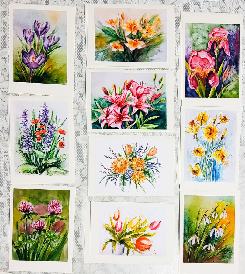
Das muss ich doch noch schnell posten: heute habe ich Briefkarten (Klappkarten mit Umschlag) mit den schönsten Blütenaquarellen des bisherigen Jahres gestaltet. Fotografiert bzw. gescannt und auf MATTEM Fotopapier ausgedruckt, sind sie wunderschön geworden, findet Ihr nicht? (Im Gegensatz zu Naturfotos kommen Reproduktionen von Aquarellen auf glänzendem Papier nicht so gut heraus wie auf mattem – schließlich ist das Original ja auch nicht glänzend!)
Just a fast post: today I’ve created cards (folded and with envelopes) featuring the best flower watercolours I’ve done this year up to now. Photos and scans have been printed on MATTE inkjet-photopaper – aren’t they beautiful? (As opposed to photos taken in nature, watercolours look much better printed on matte paper since the original painting doesn’t shine either!)
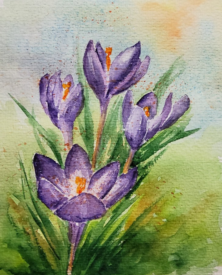
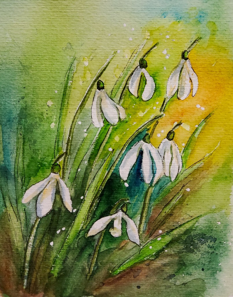
Inzwischen blühen ja auch schon Schneeglöckchen und Krokusse… Um draußen zu zeichnen, war mir der Wind heute zu kalt, daher habe ich diese beiden Blumen aus dem Kopf gemalt.
Meanwhile, snowdrops and crocuses are announcing the end of winter… Alas, today the wind was too cold for outdoor sketching, so I’ve drawn these two flowers from memory.
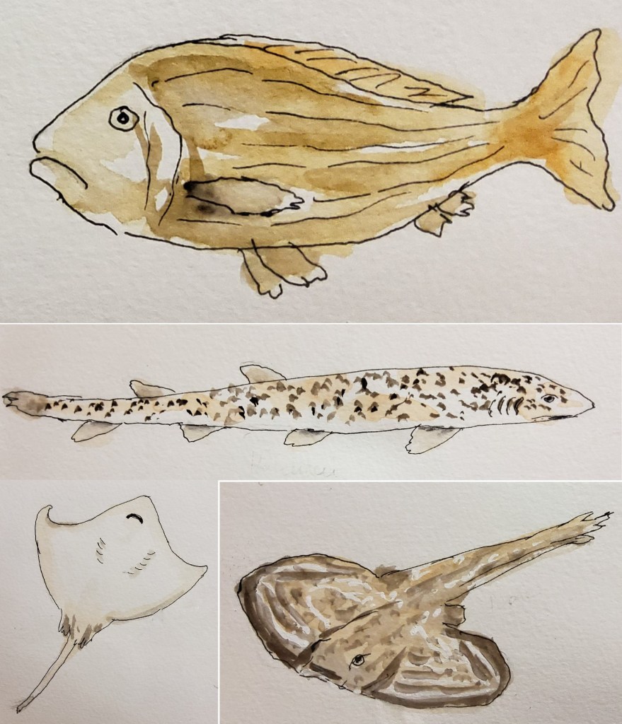
Gestern war ich in München und habe dort die tolle Ausstellung „Fäden der Moderne“ in der Kunsthalle besichtigt. Nun, DAS war ein Fest der Farben! Die ein oder andere Malidee kam mir dabei auch… Vorher allerdings besuchte ich das Sea Life Center, um dort ein wenig „live“ zu zeichnen. Nun ist das Sea Life in München kein Vergleich mit den tollen Aquarien, die ich auf Mallorca oder in Vancouver besichtigt hatte, es gab eindeutig weniger Farbe und nicht so große Fische oder Aquarien. Zum Üben war es trotzdem geeignet.
Yesterday, I went to Munich to visit the fantastic exhibition „Threads of Modern Art“ in the Kunsthalle. Well, THAT was a feast of colours! Very inspiring… Anyway, I also visited the Sea Life Centre for some „live“ drawing exercises. That said, the Munich Sea Life Centre is no comparison to the big aquariums I had already visited on the isle of Mallorca and in Vancouver: in Munich the fishes and tanks are smaller, less numerous and not as colourful. Nevertheless, it was okay for practice.
Das war das einzige richtig bunte Becken. Positiv: es gibt überall Sitzgelegenheiten. Negativ (zum Zeichnen): zwar sind die Becken beleuchtet, doch im Besucherbereich ist es ziemlich dunkel, ich konnte die Farben im Kasten, beim Mischen und auf dem Papier nicht gut erkennen. Das Ergebnis wirkt etwas „schmutzig“. Außerdem war die Seite im Büchlein etwas klein für eine so große Szene, ich hätte einen kleineren Ausschnitt wählen sollen.
This was the only tank with lots of colours. And while I was pleased to find a seat in every interesting room and the tanks were nicely luminated, there was not enough light in the visitor’s area to see the colours in the box, on the palette or on the paper. The result looks a bit „dirty“. Also, I should have chosen a smaller section, the A5 book page being too small for such a large scene.
Am Hai- und Rochen-Becken habe ich dann tatsächlich die schwimmende Bevölkerung gezeichnet – nur der kleine Rochen lag ruhig am Boden.
At the shark tank (also featuring rays and others) I actually sketched the swimming „inmates“. Only the small ray lay still on the bottom.
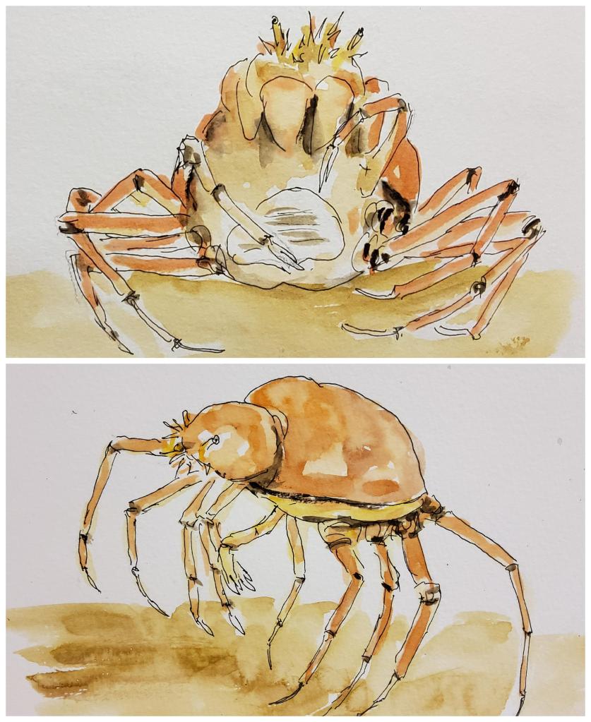
Richtig fazinierend, da so ganz anders in der Anatomie, waren die Japanischen Riesenkrabben – hier einmal als „Spitzentänzerin“ (unten) und im „Joga-Sitz“ (oben). Demnächst muss ich mal eines meiner Fotos aus den obengenannten großen Aquarien als Malvorlage heraussuchen!
Even more fascinating because of their strange anotomy were the Japanese Spidercrabs. They were moving, but slowly, so I caught one on tips like a ballerina, the other looking like practicing yoga. Well, I intend to go looking for my photos of the afore mentioned big aquariums as reference for sketching!
Nachdem draußen noch alles grau-braun ist, hatte ich mal wieder Lust auf eine „Farborgie“ am Maltisch. Da kommen dann immer die Acrylfarben ins Spiel. Entstanden sind diesmal zwei leuchtende, dekorative Bilder, die ich unter „Easy Viewing“ einordnen würde. Ab und zu tut auch das mal ganz gut – denn Energie versprühen sie allemal!
With all the gray and brown colours outside I felt like playing with bright colours for once. That’s when I turn to my acrylics. Two decorative paintings in strong colours were the result. I’d label them „Easy Viewing“. Once in a while I just need this kind of energy-boost!
Wie man sieht, habe ich mich auch großzügig bei den Metallic-Linern bedient… Und wer weiß, vielleicht lässt sich ja mit solchen Farben der Frühling endlich heraufbeschwören?😉
As you see, I’ve also used the pearl- and metallic liners lavishly… And who knows – perhaps with these bright colours spring will be conjured at last?😉
Den Hintergrund dieses Aquarells habe ich mit Salz gestaltet, und das gefällt mir hier besonders gut! Das zugrunde liegende Foto hatte ich im Gegenlicht aufgenommen, was die Blüten wunderbar zum Leuchten brachte – gar nicht so einfach, das beim Malen nachzuempfinden…
For the background of this picture I’ve used salt, the effect of which I really like here! The reference photo had been taken as contre-jour shot, which made the flowers glow and shine – not easy to recreate that when painting…