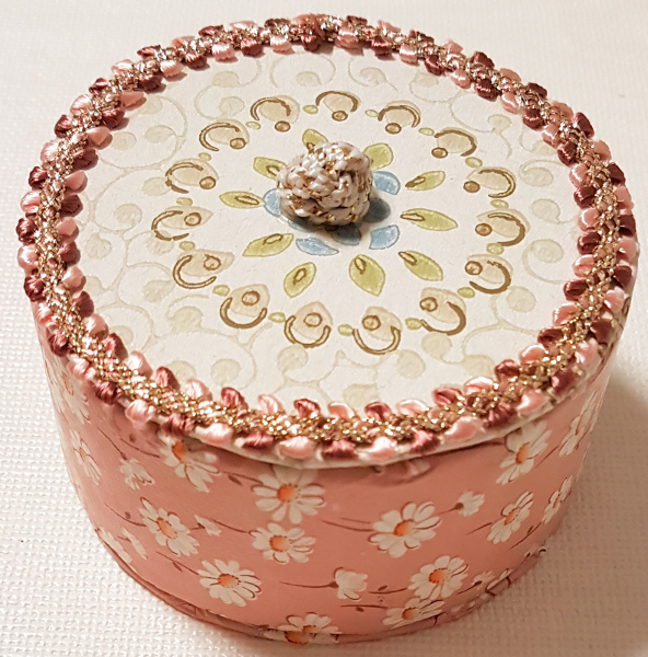
Zwei Reststücke alter Tapete, die ich im Sozialkaufhaus gefunden hatte, kommen hier zum Einsatz: eine kleine Dose – für Schmuck oder kleine Geschenke – und ein ebenfalls alter, kleiner Lederkoffer, der nun einen neuen Look erhielt. Doch zunächst die Dose:
Two vintage wallpapers from the charity shop/thrift store have been used here: a small round box – for jewelry or small gifts – and a small, vintage leather suitcase which now got a new look. But first the box:
Da war zunächst die Papprolle, die ich beinah weggeworfen hätte: das Kreppklebeband darauf war verbraucht, doch die große Rolle kann doch noch verwendet werden! Etwas Graupappe für Boden und Deckel, die zwei Tapeten und ein Stück Borte – die Box ist schnell gemacht!
The empty roll which had supported masking tape and which I nearly wasted: no, I could use this large roll for some craft! A piece of grey cardstock, the wallpapers and a bit of decorative border – this box is fast and fun to make!

Vor dem Zusammenkleben werden alle Teile beidseits mit der Tapete beklebt; ich habe dabei die Motive so verwendet, dass das große Blütenmotiv zentral auf den Deckel kam. Etwas Borte um den Rand als Zierde, ein Bortenknoten als Knopf auf dem Deckel, damit man ihn leichter abnehmen kann. Unten sieht man, wie eine dickere Borte auch dazu dient, den Deckel vom Verrutschen auf der Dose zu hindern – entlang des Innenrands der Dose auf die Deckelunterseite geklebt.
Just cover the pieces on all sides with the wallpapers before glueing them together. Choose the designs to best effect – here I’ve opted for the flower motive as a central focus on the lid. A bit of decorative braid adds interest on the edge of the lid; a knot of the braid glued to the middle of the lid isn’t just nice but also makes it easier to grab. Below you see how a piece of bulky braid border also keeps the lid from sliding from the box: glue it to the bottom of the lid so it matches into the inside edge of the box.

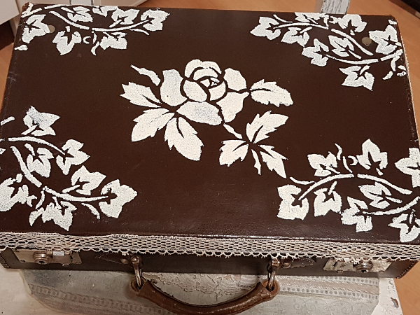
Oben: den Lederkoffer hatte ich leider nicht im Urzustand fotografiert, doch man bekommt auch so einen Eindruck davon – ein klassischer Lederkoffer. Den deckel habe ich mit cremefarbener Kalkfarbe per Schablonen verziert, der Deckelrand bekam eine alte Spitzenborte. Die Tapete brauchte ich für innen:
Above: alas I had missed to take a „before“-photo of the suitcase, but I think you can imagine – a classic leather suitcase. For the lid I’ve used offwhite chalk paint with stencils; for the edges a vintage lace border. The wallpaper has been used inside:
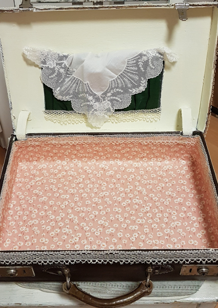
Wie man sieht, habe ich für die Deckelinnenseite nochmal die Kalkfarbe verwendet – der Koffer war ganz mit altem grünem Moiréestoff ausgekleidet, der teils verfleckt war und sehr düster wirkte (Die Tasche im Deckel ist noch original). Den Boden und die Seiten sind nun mit der rosa Tapete verkleidet – davon hatte ich ein größeres Stück. Auch hier habe ich Kanten und Ränder mit der Spitzenborte beklebt. Die Wirkung ist nun viel freundlicher – und echt shabby-chic! Ich verwende ihn, um alle möglichen Kleinpapiere zum Basteln zu verstauen (unten) – teils in alten Geschenk- und Zigarrenboxen.
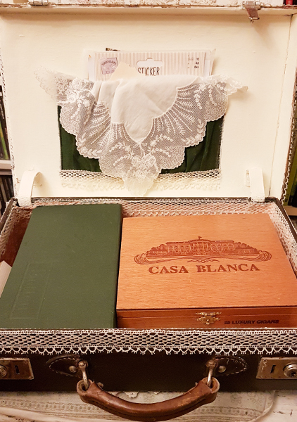
As you see, the inside lid has been painted with chalk paint, too – I didn’t like the original dark green moirée material which showed some blotches. For the lower inside the larger one of the wallpapers came in handy; again the edges have been embellished with the vintage lace border. Now it looks much more friendly and really shabby-chique! It’s already been put to use: containing all the small bits of interesting papers I need for crafting and making books etc. Some vintage cigar boxes and gift boxes harbour the tiny bits and pieces:


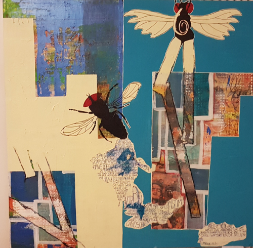
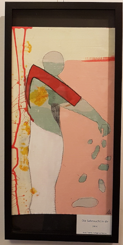 „Die Sehnsucht in Dir“ – „The Longing Inside You“
 „Die Sehnsucht in mir“ – „The Longing Inside Me“
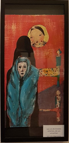 „Lass uns die Schatten umarmen, die uns umnachten“ – „Let’s Hug the Shadows That Haunt Us“
 „Der Anfang ist nah“ Der Text im Bild ist ein Gedicht von Mascha Kalénko über die Zeit. – „The Beginning Is Near“ The text in the picture is a poem about time, by Mascha Kalénko.


